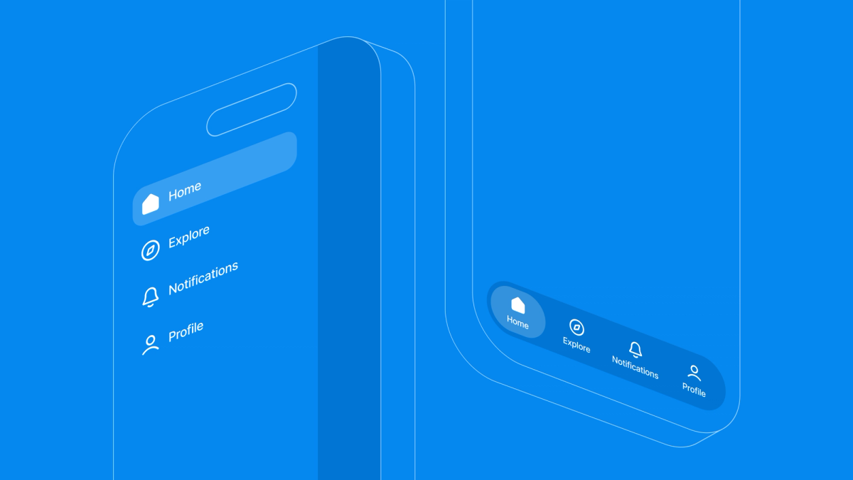
You've got a bottom tab bar working. Then a mockup lands with a hamburger menu that slides out over the tabs: a workspace switcher, settings, a link to support. Now you need both navigation patterns at once, one nested inside the other, without the drawer swipe fighting your image carousel or the tab state resetting every time someone opens the menu.
A persistent bottom tab bar paired with a global sidebar drawer is a common pattern in cross-platform apps. Nest those navigation trees carelessly, though, and you invite performance overhead and gesture conflicts.
With Expo Router, you map these flows directly onto a file-system directory. Your code stays modular and maintainable, and the native navigation components still do the work underneath. I shared a demo of this on twitter and the Expo team reached out about sharing my process. Hopefully by the end of this post you'll have a drawer wrapping a tab navigator, plus the theming and gesture handling that keep the whole thing from feeling janky.
Architectural fit: when to nest drawers and tabs
Combining navigation patterns is powerful, but it shouldn't be your default. Before writing any code, work out whether your app's UX actually benefits from a dual-navigation hierarchy. Three rough cases:
- Flat navigation (3 to 5 high-level screens with isolated paths): use pure bottom tabs. A side drawer here just adds cognitive load and visual clutter.
- Contextual isolation (a multi-tab workspace that needs omnipresent utilities like org switching or support): nest the tab navigator inside an outer drawer container.
- Deep-linked workflows (transaction-heavy dashboards where users bounce between deep sub-routes): reach for native stack navigation with context-driven visibility instead.
Architectural tradeoffs and limitations
Clean file-system layout paths ease structural complexity, but a few constraints are worth knowing about:
- State synchronization: Passing shared global state or active user details from a standalone drawer route (like a detached
settings.tsx) down into the nested tab context takes deliberate context scoping, or an external store. - Platform gesture conflicts: Side-swipe drawer gestures can conflict with horizontal elements inside your tabs, like swipeable carousels or swipe-to-delete lists. Restricting
swipeEdgeWidthkeeps those interactions predictable.
The core architecture
To keep navigation state unified, your project directory should mirror your layout tree. Instead of a centralized routing config file, Expo Router lets you declare the view hierarchy directly with folder grouping semantics like (drawer) and (tabs).
app/├── (drawer)/│ ├── _layout.tsx # Outermost navigation wrapper (configures side drawer)│ ├── (tabs)/│ │ ├── _layout.tsx # Inner layout (configures persistent bottom tabs)│ │ ├── index.tsx # Home dashboard screen│ │ ├── explore.tsx # Explore feed screen│ │ ├── notifications.tsx│ │ └── profile.tsx # User profile screen│ └── settings.tsx # Standalone global route accessed via drawer└── _layout.tsx # Root orchestration and app lifecycle entry point
1. Root orchestration (app/_layout.tsx)
The root file is where the app lifecycle starts. It manages the native splash screen and sets up global context providers, so runtime configuration is in place before any child route renders.
import 'react-native-gesture-handler';import React, { useState } from 'react';import { Slot } from 'expo-router';import { GestureHandlerRootView } from 'react-native-gesture-handler';import { SafeAreaProvider } from 'react-native-safe-area-context';import { StyleSheet } from 'react-native';import * as ExpoSplashScreen from 'expo-splash-screen';import { ThemeProvider } from '../src/context/ThemeContext';import SplashScreenView from '../src/screens/SplashScreen';// Prevent splash screen from auto-hiding before initialization checks finishExpoSplashScreen.preventAutoHideAsync();export default function RootLayout() {const [appIsReady, setAppIsReady] = useState(false);const handleSplashFinish = async () => {setAppIsReady(true);// Securely unblock rendering and hide native splash once app asset states are verifiedawait ExpoSplashScreen.hideAsync();};return (<GestureHandlerRootView style={styles.root}><SafeAreaProvider><ThemeProvider>{/* Render layout contents once splash sequencing is complete */}{appIsReady && <Slot />}<SplashScreenView onFinish={handleSplashFinish} /></ThemeProvider></SafeAreaProvider></GestureHandlerRootView>);}const styles = StyleSheet.create({root: { flex: 1 },});
2. Global side drawer implementation (app/(drawer)/_layout.tsx)
The side drawer is the outermost layout boundary. It uses the expo-router/drawer module for configuration. Setting drawerType to 'front' makes the drawer panel overlay the active screen instead of pushing it aside.
import React from 'react';import { Drawer } from 'expo-router/drawer';import { useTheme } from '@/src/hooks/useTheme';import DrawerContent from '@/src/components/DrawerContent';export default function DrawerLayout() {const { theme } = useTheme();const c = theme.colors;return (<DrawerdrawerContent={(props) => <DrawerContent {...props} />}screenOptions={{headerShown: false,drawerType: 'front',drawerStyle: {width: 270,backgroundColor: c.drawerBackground,},overlayColor: 'rgba(0,0,0,0.6)',swipeEdgeWidth: 40,}}>{/* Target internal tab group layout matching file path semantics */}<Drawer.Screenname="(tabs)"options={{ drawerLabel: 'Dashboard' }}/>{/* Standalone layout entry outside of the core bottom tab bar */}<Drawer.Screenname="settings"options={{ drawerLabel: 'Settings' }}/></Drawer>);}
3. Nested bottom tab layout (app/(drawer)/(tabs)/_layout.tsx)
Nesting the tab layout folder inside the (drawer) path means child routes inherit the drawer context automatically. Micro-interactions live in custom components, which keeps the layout files focused on routing.
import React from 'react';import { Tabs } from 'expo-router';import { Platform } from 'react-native';import { useTheme } from '@/src/hooks/useTheme';import { DrawerSceneWrapper } from '@/src/components/DrawerSceneWrapper';import AnimatedTabIcon from '@/src/components/AnimatedTabIcon';const TABS = [{ name: 'index', title: 'Home', icon: 'home-outline', activeIcon: 'home' },{ name: 'explore', title: 'Explore', icon: 'compass-outline', activeIcon: 'compass' },{ name: 'notifications', title: 'Notifications', icon: 'notifications-outline', activeIcon: 'notifications', badge: true },{ name: 'profile', title: 'Profile', icon: 'person-outline', activeIcon: 'person' },];export default function TabsLayout() {const { theme, isDark } = useTheme();const c = theme.colors;const tabBarBg = isDark ? 'rgba(11,11,19,0.98)' : 'rgba(255,255,255,0.98)';const tabBarBorder = isDark ? 'rgba(255,255,255,0.06)' : 'rgba(0,0,0,0.05)';return (<DrawerSceneWrapper><TabsscreenOptions={{headerShown: false,tabBarStyle: {backgroundColor: tabBarBg,borderTopWidth: 0.5,borderTopColor: tabBarBorder,height: Platform.OS === 'ios' ? 84 : 66,paddingBottom: Platform.OS === 'ios' ? 24 : 8,paddingTop: 10,elevation: 0,shadowColor: isDark ? '#000' : '#6060aa',shadowOffset: { width: 0, height: -2 },shadowOpacity: isDark ? 0.3 : 0.06,shadowRadius: 12,},tabBarActiveTintColor: c.tabBarActive,tabBarInactiveTintColor: c.tabBarInactive,tabBarLabelStyle: {fontSize: 10,fontWeight: '400',marginTop: 0,letterSpacing: 0.1,},}}>{TABS.map((tab) => (<Tabs.Screenkey={tab.name}name={tab.name}options={{title: tab.title,tabBarIcon: ({ focused, color }) => (<AnimatedTabIconfocused={focused}icon={tab.icon}activeIcon={tab.activeIcon}badge={tab.badge}color={color}activeColor={c.tabBarActive}/>),}}/>))}</Tabs></DrawerSceneWrapper>);}
4. UI layer micro-interactions (src/components/AnimatedTabIcon.tsx)
Animations run only where they matter. With shared values from React Native Reanimated, transforms and opacity changes execute on the UI thread. Each micro-interaction stays isolated, so a tab animation doesn't trigger re-renders across the parent layout.
import React, { useEffect } from 'react';import { StyleSheet, View } from 'react-native';import { Ionicons } from '@expo/vector-icons';import Animated, {useSharedValue,useAnimatedStyle,withTiming,withSequence,Easing,} from 'react-native-reanimated';interface TabIconProps {focused: boolean;icon: string;activeIcon: string;badge?: boolean;color: string;activeColor: string;}export default function AnimatedTabIcon({focused,icon,activeIcon,badge,color,activeColor,}: TabIconProps) {const scale = useSharedValue(1);const dotOpacity = useSharedValue(focused ? 1 : 0);const dotScale = useSharedValue(focused ? 1 : 0);useEffect(() => {const ease = { duration: 200, easing: Easing.out(Easing.cubic) };if (focused) {scale.value = withSequence(withTiming(1.15, { duration: 100, easing: Easing.out(Easing.quad) }),withTiming(1, { duration: 150, easing: Easing.out(Easing.cubic) }),);dotOpacity.value = withTiming(1, ease);dotScale.value = withTiming(1, ease);} else {scale.value = withTiming(1, { duration: 160, easing: Easing.out(Easing.cubic) });dotOpacity.value = withTiming(0, { duration: 150, easing: Easing.out(Easing.quad) });dotScale.value = withTiming(0, { duration: 150, easing: Easing.out(Easing.quad) });}}, [focused]);const iconStyle = useAnimatedStyle(() => ({transform: [{ scale: scale.value }],}));const dotStyle = useAnimatedStyle(() => ({opacity: dotOpacity.value,transform: [{ scale: dotScale.value }],}));return (<View style={styles.iconWrap}><Animated.View style={iconStyle}><Ioniconsname={(focused ? activeIcon : icon) as any}size={22}color={color}/></Animated.View><Animated.View style={[styles.activeDot, dotStyle, { backgroundColor: activeColor }]} />{badge && !focused && <View style={[styles.badgeDot, { borderColor: 'transparent' }]} />}</View>);}const styles = StyleSheet.create({iconWrap: {width: 44,height: 28,alignItems: 'center',justifyContent: 'center',gap: 4,},activeDot: {width: 4,height: 4,borderRadius: 2,},badgeDot: {position: 'absolute',top: 0,right: 4,width: 6,height: 6,borderRadius: 3,backgroundColor: '#f43f5e',borderWidth: 1,},});
5. Scalable theme architecture: eliminating flash of unstyled content
To apply theme changes across nested boundaries without a flash of unstyled content, we use design tokens. Primitive values map to a semantic theme type, so components, navigation styles, and layouts all pull from one schema synchronously.
// src/theme/colors.tsexport const palette = {indigo50: '#eef2ff',indigo100: '#e0e7ff',indigo400: '#818cf8',indigo500: '#6366f1',indigo600: '#4f46e5',indigo700: '#4338ca',neutral50: '#fafafa',neutral900: '#171717',white: '#ffffff',black: '#000000',};export type Theme = typeof lightTheme;export const lightTheme = {dark: false,colors: {background: '#f8f8fc',surface: '#ffffff',primary: palette.indigo500,tabBarActive: palette.indigo500,tabBarInactive: '#b0b0c8',drawerBackground: '#ffffff',text: '#1a1a2e',statusBar: 'dark-content' as 'dark-content' | 'light-content',},};export const darkTheme: Theme = {dark: true,colors: {background: '#0f0f1a',surface: '#1a1a2e',primary: palette.indigo400,tabBarActive: palette.indigo400,tabBarInactive: '#4a4a6a',drawerBackground: '#13131f',text: '#eeeeff',statusBar: 'light-content' as 'dark-content' | 'light-content',},};
Summary and key framework documentation
Nesting navigation like this is mostly an exercise in discipline. Pushing routing config into the file system with Expo Router keeps layouts scaling cleanly, without a big configuration file to maintain.
For more on configuration and styling options, see the official docs:
- Expo Router directory grouping: how route groups nest, in the Expo Router introduction.
- Customizing the drawer: all the drawer options in the Expo Router drawer guide.
- React Navigation tab bar options: the full list in the bottom tab navigator docs.
Where to go next
Start with the boundary. Get (drawer)/_layout.tsx rendering, then nest the (tabs) group inside it and confirm both layouts show up before you touch theming or animations. Add the gesture constraints last, once the structure holds. Building it in that order keeps you from debugging a swipe conflict and a routing bug at the same time.
If you build something with this pattern, or hit an edge case we didn't cover, come share it in the Expo Discord. We hang out in the Expo Router channels and read the reports.